
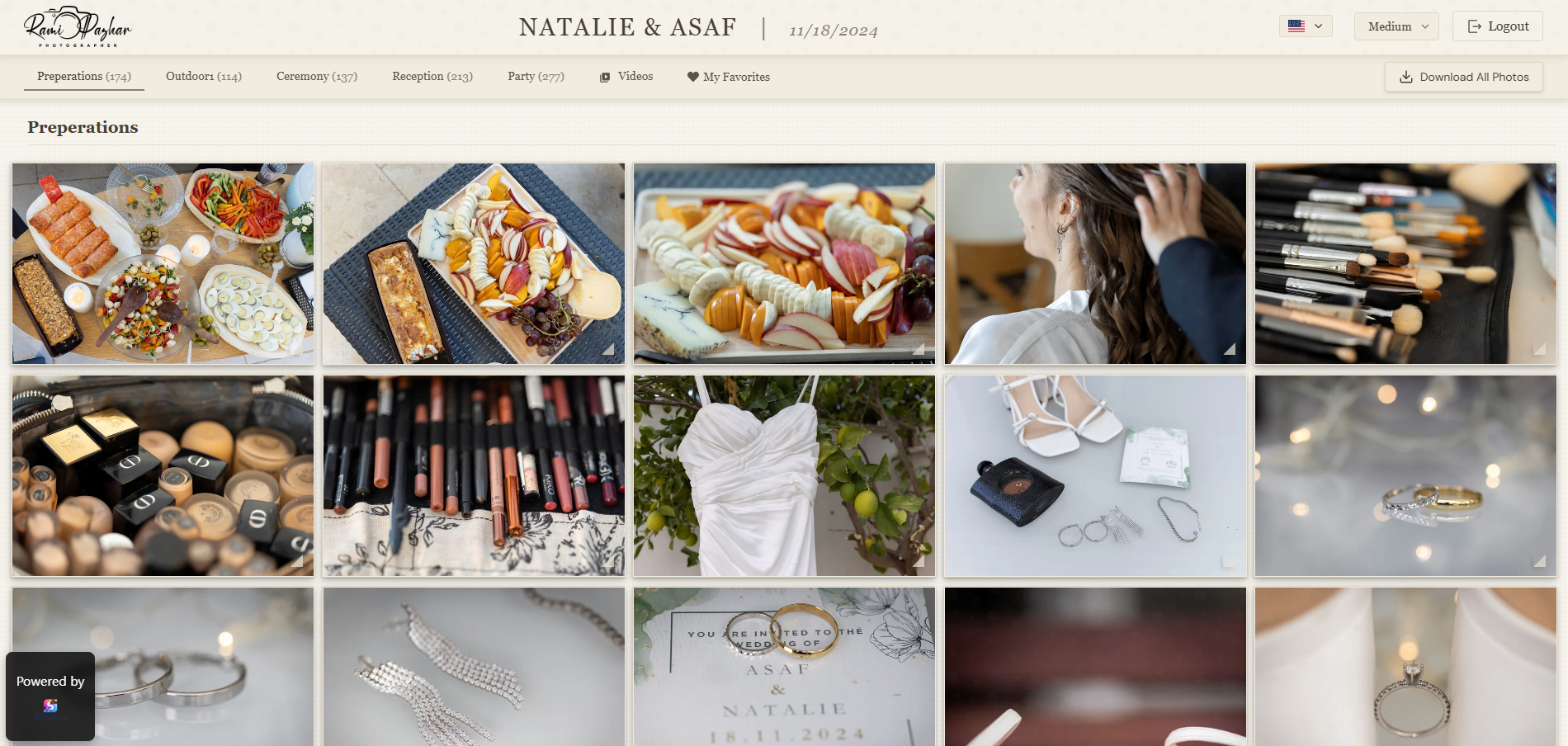
Presentation is part of the product-not decoration on top of it.
Clients judge your photography through the gallery you send. A strong cover, clear names, calm layout, and easy downloads make the same images feel more intentional and professional.
Start with a stronger first impression
The first screen of the gallery sets the tone. Before a client looks at a single photo in detail, they already decide whether the experience feels polished or improvised.
A calm layout, one clear title, and an obvious path to browse or download beat busy chrome and competing buttons.
Think of the gallery like a quiet reception desk: welcome the client, show them where to go, and stay out of the way of the photos.
When the opening screen feels intentional, clients trust the rest of the experience more-even before they love a single frame.
Choose a cover image and title that feel intentional
Your cover image is the handshake. Pick a frame that represents the shoot emotionally-not a random mid-gallery crop or a busy group shot that does not read at thumbnail size.
The gallery title should be client-facing: couple names and date, family name and session type, or event name. Avoid internal job codes or camera filenames in the title clients see.
If your platform supports a short description, keep it to one or two sentences: what is inside, and what they can do (view, favorite, download).
Revisit the cover after you finish sorting. The strongest opening image is often clearer once the full story of the gallery is in place.
Structure and naming that clients understand
Sections should follow the client's story, not your Lightroom collection names. Ceremony, Portraits, Reception, Getting Ready-or Session Highlights and Full Gallery-are clearer than Edit Pass 2 or Selects_v3.
Order images so the gallery has a beginning. Leading with weak frames or a random dump of every export makes even great photos feel less curated.
When a shoot is large, fewer well-named sets beat dozens of tiny folders. Clients should never wonder which folder holds the photos they care about.
Make actions and next steps obvious
A gallery feels less professional when clients are unsure what to do next. Keep primary actions visible: browse, favorite if you use proofing, and download.
Good UX is rarely about adding features. It is usually about removing confusion-one private link, clear labels, and no desktop-only instructions.
If clients need an account, password, or payment step, say so in your delivery email so the gallery itself does not become a surprise wall.
Design the gallery for phones first
Many clients open the link on a phone before they ever sit at a computer. If thumbnails are tiny, text wraps badly, or downloads are buried, the gallery feels unfinished.
Preview the gallery yourself on a real phone: cover crop, section names, lightbox pinch-zoom, and single-image download. Fix anything that requires a tutorial.
Mobile presentation is not a secondary theme-it is how most relatives and guests will experience your work when a client forwards the link.
If something is awkward on a phone, clients rarely blame their device. They blame the gallery-and by extension, your brand.
Download UX that feels professional
Easy downloads are part of presentation. If clients cannot find how to save a photo or the whole gallery, they will ask you-or assume the delivery is incomplete.
Decide before sharing whether clients can download everything, selected images only, or view-only until selection is done. Match the setting to what you promised in the contract.
Label download actions in plain language. Prefer one clear control over multiple competing export options that only photographers understand.
Themes and colors that support the photos
The gallery theme should frame the images, not compete with them. Soft neutrals, dark calm backgrounds, or light minimal layouts usually serve photographs better than loud accent colors.
High-contrast neon buttons, heavy patterns, and decorative frames can make even strong images look like a template. Let spacing and typography do the polish work.
If you brand with a signature color, use it sparingly-links, a thin accent, or the logo-so the photos remain the hero.
Keep branding clean and restrained
Professional branding does not mean placing your logo everywhere. It means consistent naming, clean type, good spacing, and a gallery that feels like your studio-not a storage dump.
The gallery should feel connected to your work. If removing a decorative element makes the photos clearer, remove it.
Small details that raise perceived quality
Image order, section naming, spacing, cover crop, and mobile behavior all affect how polished the gallery feels-even when the edits are already excellent.
Check for broken empty sets, leftover test images, and typos in titles before the client sees them. Those tiny misses break trust faster than most photographers expect.
Together, these details shape how clients talk about your service when they share the gallery with family and friends.
Checklist before you share the gallery
Run this list once before sending the private link. Five minutes here prevents awkward follow-up emails.
When everything below is green, the gallery is ready to feel like a finished product.
- Cover image reads clearly at small sizes and matches the shoot
- Gallery title and section names are written for the client
- Downloads match what you promised (all / selected / view-only)
- You previewed the gallery on a phone as well as desktop
- Theme and branding stay quiet so photos stay primary
- Delivery email has one primary link and short instructions
Frequently asked questions
How can I make my client gallery look more professional?
Strengthen the first screen with a clear cover and title, name sections for clients, keep actions visible, polish mobile layout, and keep branding restrained so photos stay primary.
Does gallery design affect client experience?
Yes. A cleaner, calmer gallery makes the same images feel more intentional and often reduces support questions about how to view or download.
What matters most in gallery presentation?
Clarity, a strong cover image, client-friendly naming, easy downloads, a good mobile experience, and themes that support the photos instead of competing with them.
How should I choose a cover image for a client gallery?
Choose an emotionally strong frame that still reads at thumbnail size-usually a clean portrait or signature moment-not a busy scene or a random export from the middle of the shoot.
Should client gallery themes be colorful or minimal?
Minimal or calm themes usually look more professional. Soft neutrals or dark quiet backgrounds frame photos better than loud colors and heavy decoration.
How do I make a gallery easy to use on mobile?
Preview on a real phone, keep section names short, make download and browse actions easy to tap, and avoid layouts that only work well on a wide desktop screen.
Final thought
A professional client gallery is not about flashy design. It is about clarity, restraint, and care-so clients experience your photos the way you intended.