Professional does not have to mean complicated.
A lot of photographers think a gallery feels professional only if it has dozens of advanced features. Usually that is not the thing clients notice first. Clients notice clarity, beauty, and how easy everything feels. In other words, the usual human habit of judging quality in about three seconds.
Start with a strong first screen
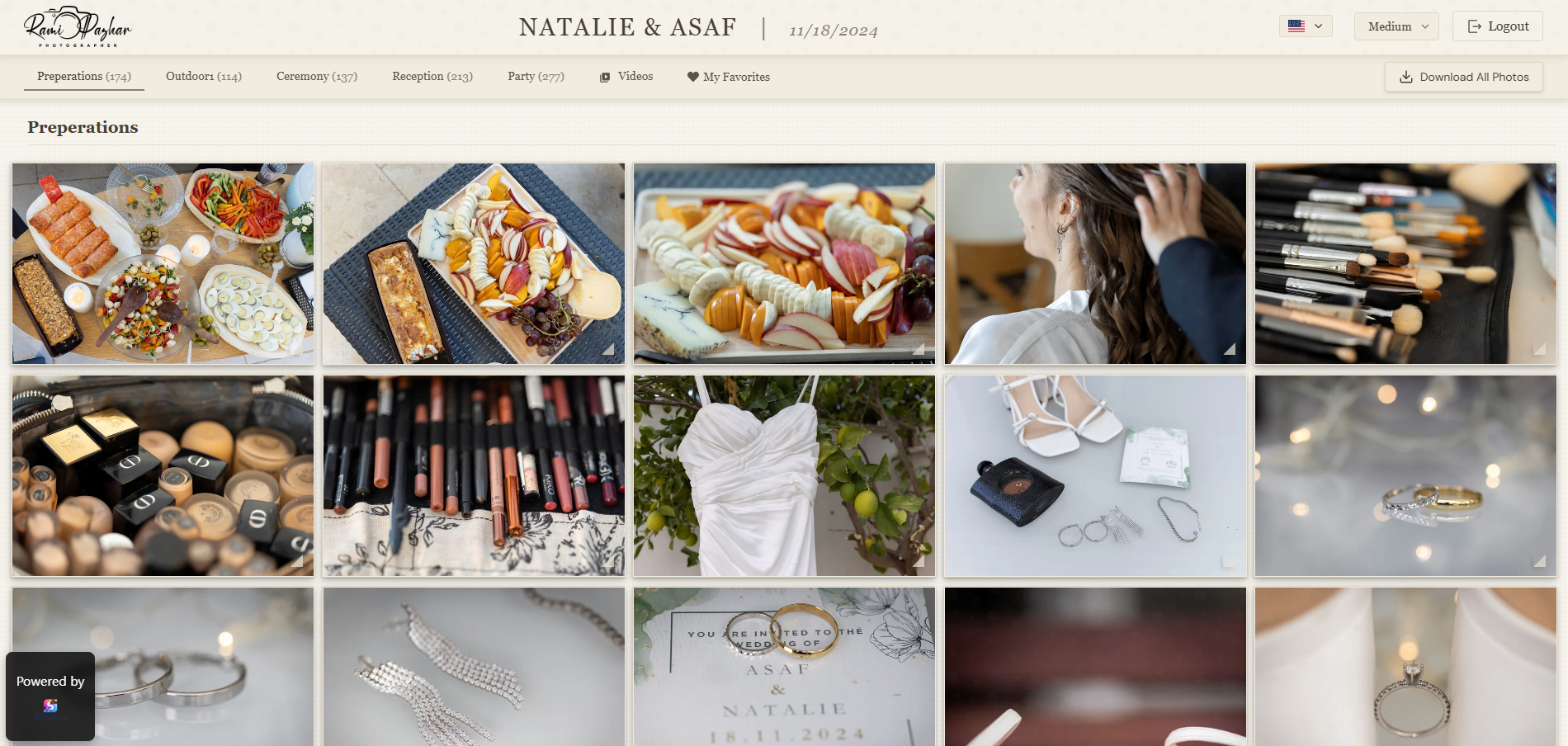
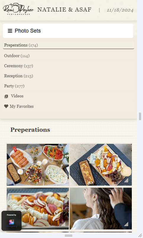
The first thing clients see sets the tone for the whole gallery. A clean cover image, a clear gallery title, and a tidy top area instantly make the experience feel more intentional. If the opening screen looks cluttered or generic, the gallery can feel less premium even when the photos are excellent.
Think of the opening screen like the entrance to a studio. It does not need to be flashy. It just needs to feel calm, polished, and welcoming.
People often decide whether something feels professional before they click the second photo.
Keep the branding clean and consistent
A professional gallery should feel connected to your brand. That does not mean putting your logo in seventeen places like it is running for office. It means using a consistent visual language: the same tone, clean typography, nice spacing, and colors that support the photos instead of fighting with them.
Use your identity
A simple logo and clear gallery name are often enough to make the gallery feel branded and intentional.
Let the photos lead
Neutral backgrounds and restrained colors help the images stay in the spotlight.
Stay consistent
Matching buttons, spacing, and text styles make the whole experience feel more refined.
Make the gallery easy to understand
One of the fastest ways to make a gallery feel less professional is confusion. If clients do not know where to click, how to download, or how to select favorites, the experience instantly feels rough around the edges.
A professional feeling comes from clarity. Clear buttons. Clear labels. Obvious actions. A structure that makes sense even for people who are not especially technical, which is most people, bless them.
Simple beats clever
When the gallery layout is easy to scan and the main actions are easy to find, clients feel more confident using it and the whole experience feels more polished.
Small touches that make a big difference
Professional presentation often lives in the little things. Fast loading. Good spacing. Buttons that feel deliberate. A well-chosen cover photo. Download actions that are easy to find. Consistent text. These are not dramatic features, but together they change how the gallery feels.
Feels less professional
- Crowded screens and unclear hierarchy
- Random naming and inconsistent text
- Important actions hidden or hard to find
Feels more professional
- Clean layout with breathing room
- Consistent titles and visual style
- Downloads and selections are obvious
Easy improvements you can make right away
Choose a better cover image
Pick one image that sets the mood immediately and represents the gallery well.
Use a clear gallery title
A simple, well-written title feels better than generic file-style naming.
Keep actions visible
Make downloads, favorites, and selection tools easy to spot and understand.
Reduce visual noise
A little whitespace and cleaner layout can make the whole gallery feel more premium.
Final thought
Making your gallery feel more professional is usually not about adding complexity. It is about removing friction, improving presentation, and making clients feel that everything was designed with care. Small details do a lot of heavy lifting, because apparently humans love vibes almost as much as they love photos.